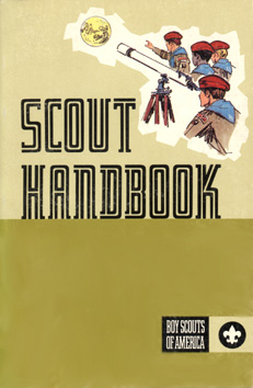
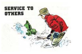
I’ve always admired the austerity and simplicity of the 8th edition of the Boy Scout Handbook (1972-76), which I read during my harrowing time in the Scouts. The subtle greens and no-nonsense font complement the inside illustrations, which are impressionistic line drawings:
There is a sophistication that works nicely with the simplicity of the Handbook’s messages: Be a good person. Be a good citizen. And the artistry of the drawings – check out the tension lines on the boy’s pants above, how they meander outside border – suggest a respect for the (young) reader’s imagination. There’s a purposeful ambiguity at times: is the boy above Asian or White? Hispanic?
Although I had a mostly-negative experience with Scouting, my Scoutmasters quit the troop and we disbanded, I continue to enjoy the magical aspirational quality that started with Baden-Powell. The 8th edition captures this wonderfully. The design style and artwork tell the reader “This is how things could be.” rather than “This is how things are.” To any child growing up in the 70’s it was very apparent that the simple wholesome life portrayed by Scouting was at direct odds with the zeitgeist, which was suffused not only with the collapse of traditional values, but also with the collapse of 60’s idealism, which was an alternative set of values whose demise was particularly painful to youth due to its greater respect for children. I can remember when I very young, having “hippies” bending down to speak to me as if I were a person with an opinion, something the “straight” adults rarely did.
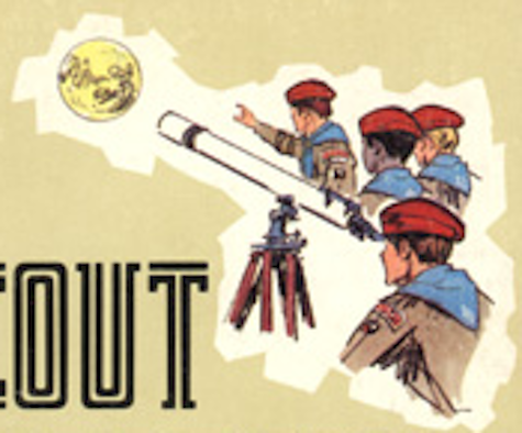
What a treat then, to be offered a world that both traditional values and alternative design. And with a philosophy that looked hopefully to the future:
And in berets no less. Yet never resorting to comic-book exaggeration, instead offering a reassuring adult sensibility.
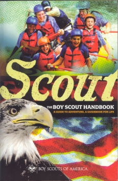
Today’s Handbook, in comparison, is a 4th of July Happy Meal that someone has dropped on the ground:
The first thing you notice is that almost half of the cover is taken up by the patriotic tableaux of a confused looking bald eagle in front of a pixelated American flag. The eagle looks anxious, as if the inflatable boat is about to come crashing down upon its head. The Scouts are unidentifiable as scouts, they could be any campers or just kids out on a rafting trip.
This cover reflects anxiety. The action is down, not up to the stars. The visual metaphor that today’s youth are being sent “down the river”, that there is no solid ground under them. And the demographic reality is that they will be forced to prop up the aging population, with few benefits or social safety net of their own. The eagle has good reason to be anxious.
The imagery is realistic, like a photograph. It says “This is how things are.” which undermines the beautiful (and useful) fiction that the 8th Edition captured so tenderly and knowingly.
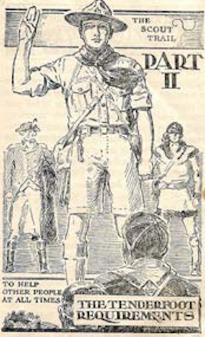
For something from the WWII era, check out this illustration from my father’s Boy Scout Handbook:
Here, the Scout, a Tenderfoot no less, is placed directly in the historical pantheon in between a Founding Father and an explorer. It looks like an illustration from “Treasure Island”. And although the collapse of civilization was a distinct possibility at the time, the tone is confident, the Scout’s identity secure. As always though, I have to point out that the good old times were not so good for those who were different. I doubt you will see many brown faces in these lovely drawings.
What then would a non de-evolutional edition of the current Boy Scout Handbook look like? It’s a cliche, but today’s world is even more complex. There is less direct disappointment than in the early 70s: you no longer see the flag-draped coffins on the evening news, there is no draft and no there are no protests. Today’s youth are numb.
A solution would wake them up, and make use of the identity-strengthening archetypes, like the WWII edition did. Another book from the 70’s that offered a way out from the turmoil was the “Whole Earth Catolog”. It featured all sorts of interesting projects and facts that were clever and low-tech. A new Scouting handbook would show kids ways to use their energy and resilience to turn reduced prospects for traditional prosperity into a positive rather than a negative. You can see this with locavore and permaculture movements. To get kids to turn away from the video game and build a lean-to is a daunting task.
I think a return to seriousness, as opposed to the current edition’s candy-apple style, might be a way of getting through to the younger generation. A new type of handbook that would convey both “This is how things are” (Wake up!) and “This is how thing could be” (Use this for inspiration). A darker, more brooding BSA Handbook is the only one that will be successful.
